- 15 August 2021
- Conversion Optimisation
- Reading time:12 min
Conversion Optimisation: An insider’s Guide
Hands up anyone who thought making money through ecommerce was going to be easy? Unlike Bricks and Mortar, your website is open 24/7, the overheads are low, and your differentiator was going to be a great user experience.

Hands up anyone who thought making money through ecommerce was going to be easy? Unlike Bricks and Mortar, your website is open 24/7, the overheads are low, and your differentiator was going to be a great user experience. No-one would care if you weren’t the cheapest because they were going to be loyal brand advocates. You had loads of Facebook fans, and all your friends told you what a great idea it would be to sell that product online.
As we all know, being successful online, is a little bit more complicated than that. At acidgreen, 100% of the sites that we build are ecommerce sites, and over the last 16 years we have seen it all. We have shared in the glory and mourned all of the failures. There are many reasons that an online business can fail and our initial consult would always be to try and test the waters with a Minimum Viable Product. Creating a beautiful site with custom features isn’t going to increase demand for a product at this stage. That money is better invested in marketing. Things like conversion optimisation, customer lifetime value, content delivery networks and onsite personalisation are all totally useless unless you have a product or service that people want to purchase.
For those lucky enough to have survived this initial stage, we have managed to identify some common themes that we feel have helped our clients to succeed over the years.
Keep in mind, there is no point investing in these until there are suitable traffic levels to justify the business case. Even the best sites who implement all of the below only have conversion rates of between 1 and 3%.
Looking for the Product
There is a lot of information out there about purchase funnels and buying cycles. Buzzwords like awareness and consideration come to mind. We are not discounting the importance of this research but when we look at our clients’ analytics, we find that the sales cycle is usually less than 1 day. By the time customers get to your site, they know what they want, and they need to find it quick.
“Sales Cycle is usually less than 1 day”
Search function
Nothing is more frustrating for a customer than the inability to find what they’re looking for. A good performing on site search facility is your most powerful asset in converting customers on your site. By analysing a cross section of our accounts we found that on average, sessions where the site search is used improves conversion rates by 465%. This means that on a site with an average conversion rate of 1.5%:
Conversion Rates without on site search are 0.75% Conversion Rates with on site search are 4.3%
Search on mobile
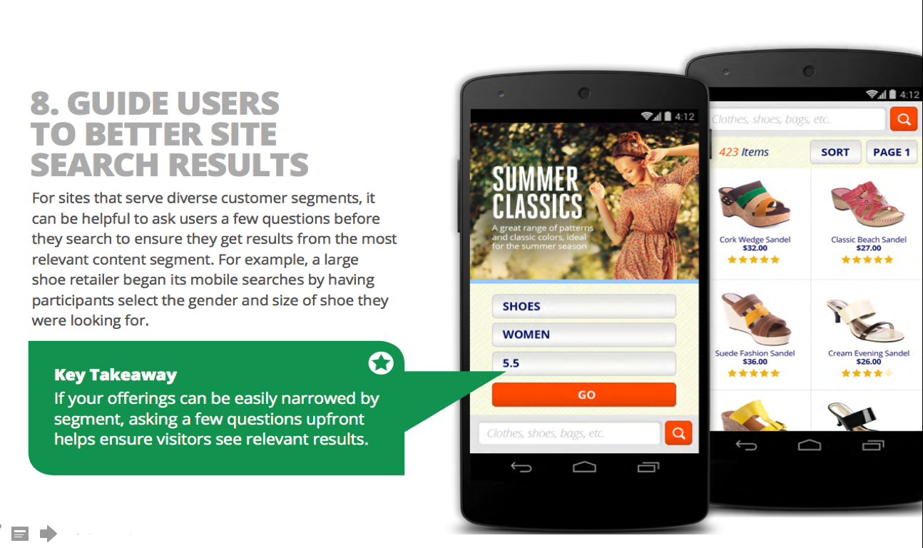
According to Google onsite search is even more necessary on mobile. Long complicated navigation menus relying on hover states just don’t seem to cut it. Google suggests segmented search as per this example from the research:

Worth Noting
Most inbuilt search engines do not have a good auto-complete or suggested search function. If you can afford it, then it is worth paying and investing for a 3rd party search function. We find that with the added ability to visually merchandise your results and add filters, the customer can get what they are looking for much quicker.
The Product Page
Design
Once your visitor has invested the time to get to your product page, you want to make sure that they can find all of the information that they need straight away.
The Nielson Group have conducted eyetracking research which shows that users speed scan content in the shape of the letter F. As you can see from the image below it is vital to put all of the important information in the right place.
The product name and image should be incorporated into the initial horizontal sweep, and then all of the important information like price, availability and short descriptions should be in the second, slightly lower, horizontal sweep.
When they finally page down vertically, as they are prepared to spend more time, you can add more detail and specifications.

Best Practices
If you really want to make the most out of the product page then you need to go that extra mile with the product descriptions and interactive content. Try and picture what information you would need if you were about to buy this product. If you are stuck for ideas take a look at one of your competitors sites. In adding some dynamic features like stock locations in stores, pop ups to highlight scarcity, reviews, social media feeds, celebrity endorsements or even associated products, you are making your content unique which not only helps SEO but also enhances the customer’s experience.
Buying the Product
68.63% is the industry average for cart abandonment (source: http://baymard.com/lists/cart-abandonment-rate)
Keep in mind that no matter how good your site experience is, almost 7 out of 10 people aren’t going to purchase. This is a behavioural thing, most of them were never intending to buy in the first place! So how do we convert those 3 purchasers into 4?
The first step is to forget about that beautiful, creative UX that you have created. This may have made them add to cart, but from here you need to leave it all behind. The checkout process is all about measurement and data. This is where you need to focus on what psychologist J.J. Gibson called Affordances. If something needs clicking make it look like a button. If it requires an action make it look obvious. Don’t rely on them to understand an SSL certificate, visually show them the checkout is secure. It’s about white space and functionality. Adding numbers to the different checkout steps and making sure that the tab order on the form is correct, has far more value than whether your button is green or orange!
Here is a list of what we find works the best for our clients:
Allow the user to purchase as a guest, it is perceived to ensure a quicker process.
Make sure that your one page payment process is compliant with
. This means that where possible the browser will auto fill all of their details.
Autofill discount codes and provide a list of current ones in the banner at the top. This encourages trust and stops them from leaving the page to search for a better price.
Remove all forms of site navigation except for shipping FAQ’s, T&Cs and Privacy Policies which can be opened up in a new window (removes any form of distraction)
Make sure you enable cart reminder emails for abandoned carts
Measure Everything
Probably the most important aspect about all of this is collating your data. Without qualitative or quantitative data, how are you supposed to decide what to do next? Free products like Google Analytics offer enterprise levels of data, but unless you customize them and record micro and macro conversions it can be hard to pinpoint the pertinent information. With Analytics, you should just be reviewing one dashboard each day. That’s all you should need. When the figures are off then you can drill down into the other reports.
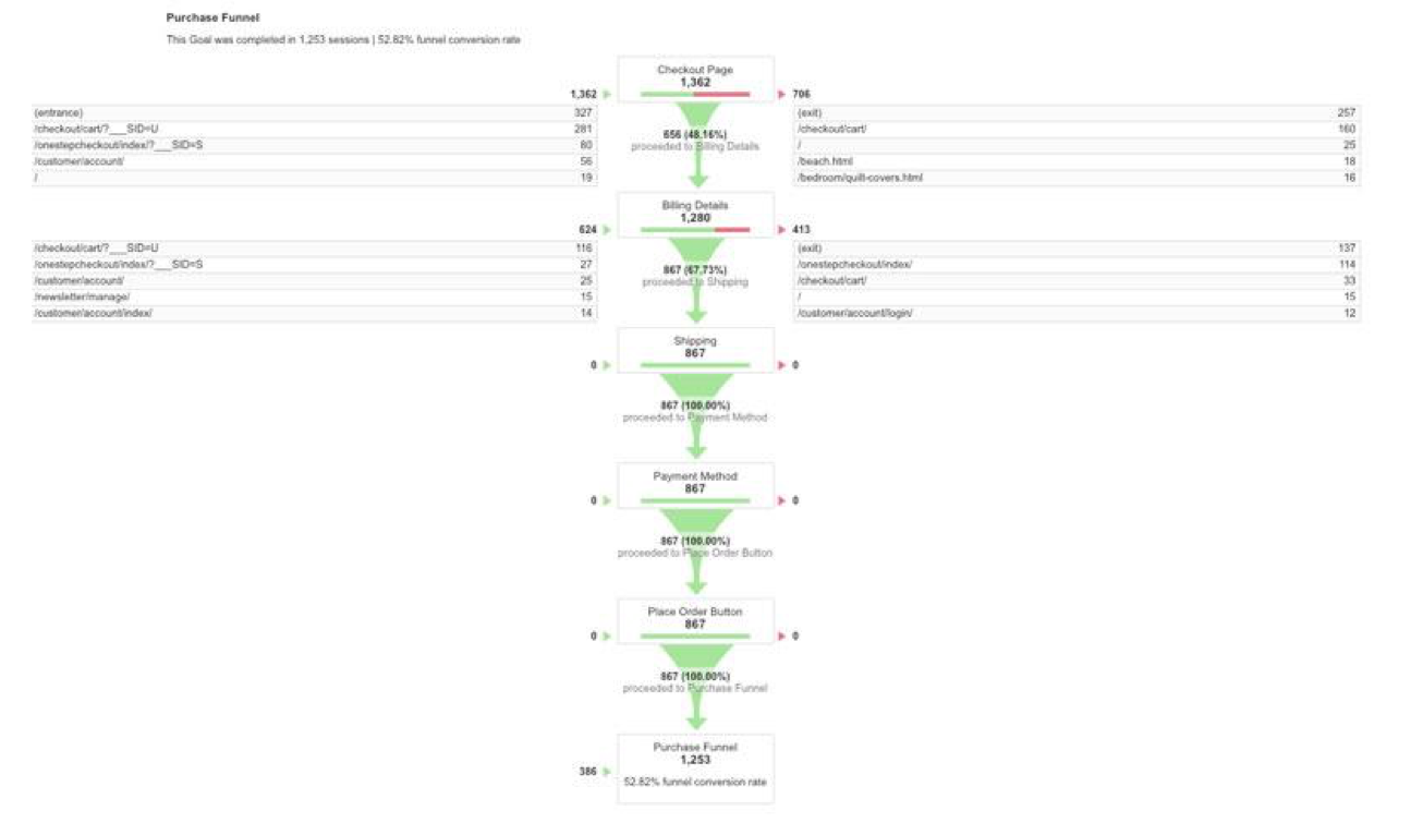
Did you know that you can still measure a one page checkout as a funnel?
For all of our clients we like to create a funnel for the checkout by using virtual pageviews (see example below). With this in place you can see if, for example, shipping rates are causing people to abandon their cart.

Record your users
Our second tip would be to supplement this quantitative data with some qualitative data. Having both sets of data makes it easier to make a decision. Software like hotjar offers screen recordings of your users behaviour without sharing sensitive data like credit cards.
Loyalty and Re-engagement
With the cost of SEM increasing each year, the more mature ecommerce stores are focusing on the 80:20 rule: The more information that you can collect about your customers the better. With the ability to segment this data by things such as lifetime value, previous purchases and demographic, you can re-activate them by email (which should be your most valuable channel). By offering them personalised recommendations, discounts and the VIP treatment not just by email, but also on site you can start to inspire some brand loyalty.
This is not as hard as it sounds and maturer cms platforms like Magento Enterprise have this built in. For platforms that don’t include this we find the most affordable option is Barilliance.
Test
Like most things in life, you usually don’t get it right the first time. After performing many A/B and Multivariate Tests on clients’ sites we have learned the hard way, that what works on one site doesn’t always work well on another. The key to success is to define the goals upfront. Formalise what you will count as statistically significant before the test has been deployed. Although it is very tempting, just because you like the look of the new version, don’t let it stay on the site permanently until it produces a statistically significant result. For more information on how to measure this, read this great article from Avinash Kaushik
Final Thought
As discussed at the beginning of the article, making money online isn’t as easy as some people think and it is only going to get harder as the market gets more saturated. None of the recommendations above are going to move the needle, unless there is enough traffic on your site.
Just like Bricks and Mortar, there needs to be an adequate demand for what you are selling in that location. If the footfall in the mall is high, so is the cost of leasing the property.
You need to greet the customer and then leave them to browse. If they like what they see, only then will they will listen to your recommendations. If they find what they want then they will buy the product so long as the queue isn’t too long. If you don’t offer free returns or you prices aren’t competitive, they will walk next door.
This article was previously posted in eWay in a four-part series.
_____
acidgreen is an award winning Magento Australian company with over 15 years of web design and development experience. Our certified magento developers, digital marketing executives and designers are highly qualified to create aesthetically pleasing magento websites that generate the highest amount of conversions that provide the best ROI. For more information on how to get started with acidgreen’s magento design and development services, and to avail of a free quote on your magento websites, contact us today!
Related articles


